
UN Dataset
A visualisation project presenting multiple United Nations datasets. Explore the world map and discover interesting facts.
Show visualisation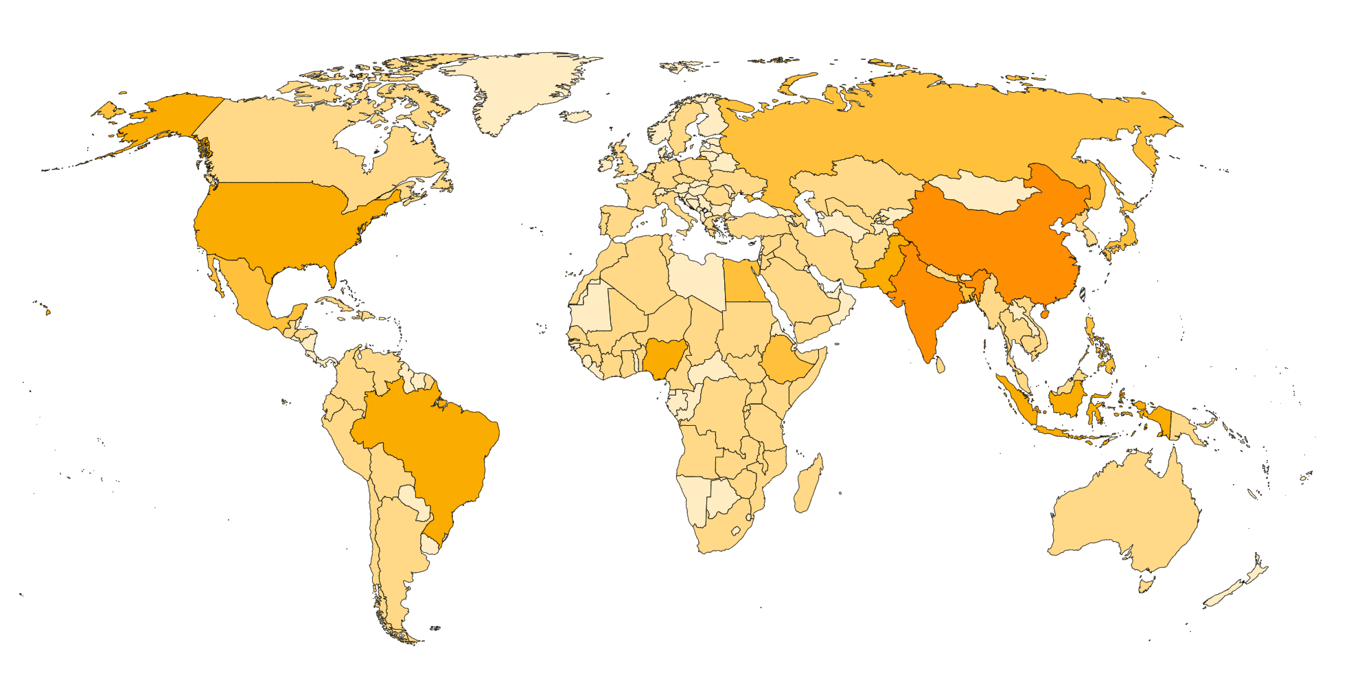
Overview
The visualization is divided into three main sections: a color-coded world map, a ranking based on the selected dataset, and a scatter plot that enables the plotting of one dataset against another. Each section offers various interactive features to enhance user experience. Here is a brief overview of the available features in each section.
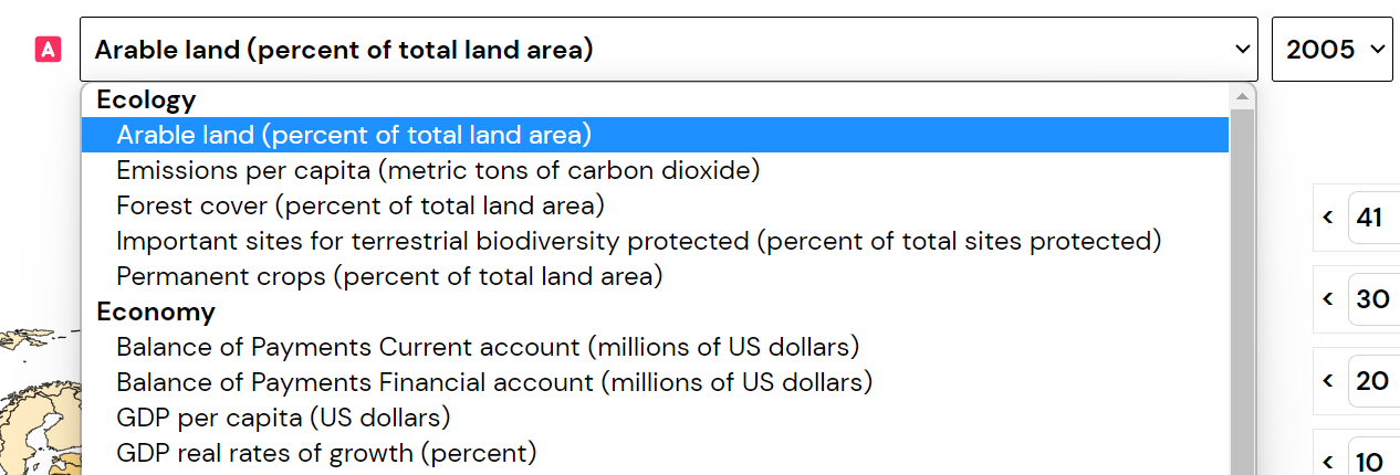
The visualization consists of two datasets, Dataset A and Dataset B, represented by corresponding emojis. Users can select a dataset from the available choices within three categories. Some datasets in the visualization include data from multiple years, allowing users to explore trends over time. When a dataset is selected, the visualization dynamically updates and loads default settings tailored explicitly to that dataset. This ensures that users are provided with relevant and meaningful visual representations of the data they have chosen to explore.
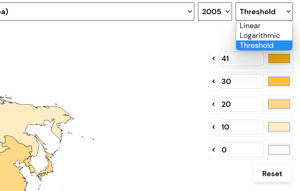
In the visualisation's world map and ranking sections, users can adjust the colour scheme and threshold values according to their preferences. However, it's important to note that when selecting the linear or logarithmic scale, the colour updates for the ranking section will not occur. To revert to the default settings, users can utilise the reset button, which will restore the original configuration of the visualisation. This allows users to easily experiment with different colour schemes and threshold values while still having the option to return to the default settings if desired.
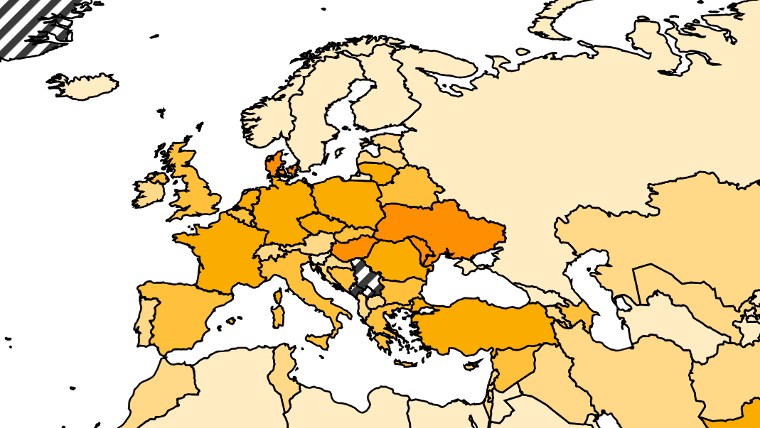
In the world map section of the visualisation, users can click on a country to zoom in and view a more detailed representation of that specific area. Clicking on the country again or selecting no country will allow users to zoom out and return to the original view. It's important to note that the zoom level is fixed and cannot be adjusted beyond the predefined levels provided in the visualisation.
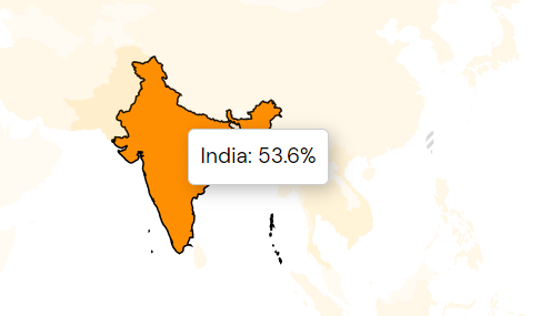
All visualisations within the visualisation tool feature a hover effect, which means that when users hover their cursor over a specific data point, the corresponding value of that data point will be displayed. This interactive feature enhances the user experience by providing real-time information and allowing users to explore the details of the data.
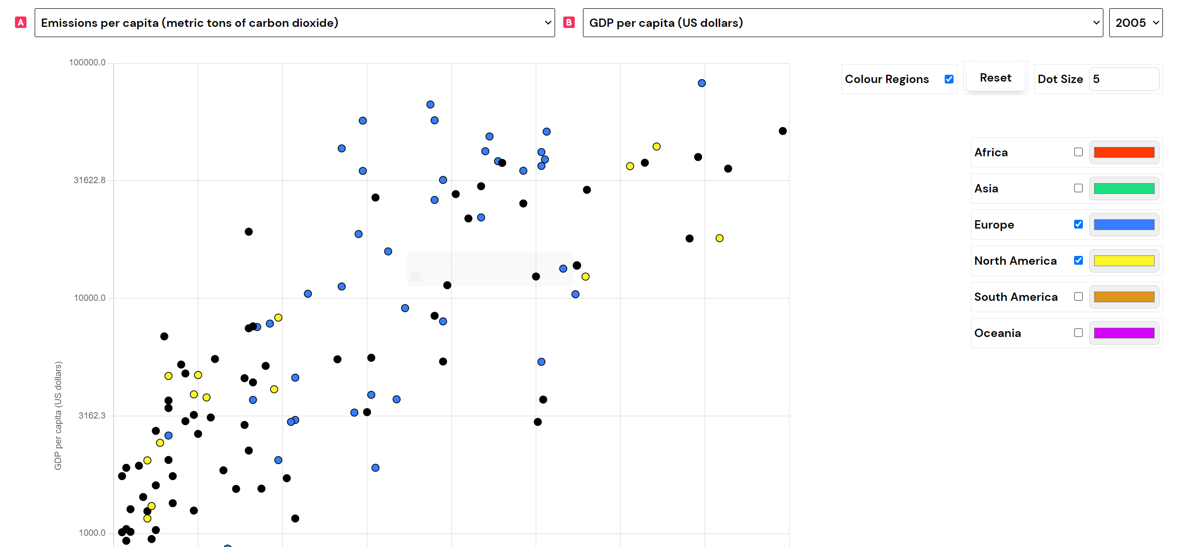
The scatter plot section displays two datasets, with Dataset A on the x-axis and Dataset B on the y-axis, enabling users to examine their relationship. Countries in the scatter plot are colour-coded based on their regions, providing visual grouping, and users can toggle the display of colours for regions or choose to make all countries uniform. The scatter plot offers a reset button to revert to the default settings, allowing users to start fresh.
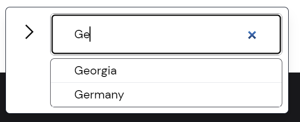
The visualisation includes a search feature in the bottom right corner. Users can search for a specific country and highlight it in the visualisations. The arrow icon minimises the search feature while pressing 'x' removes the focus from the selected country.
You can explore the data with this brief overview of the visualisation's features. Enjoy uncovering insights and gaining a deeper understanding of the information presented. Happy exploring!